Genuine vs. Dyed or Heat-Treated Crystals: A Spotter's Guide
Learn to spot dye pooling, unnatural saturation, and coated surfaces with simple at-home checks, and read...

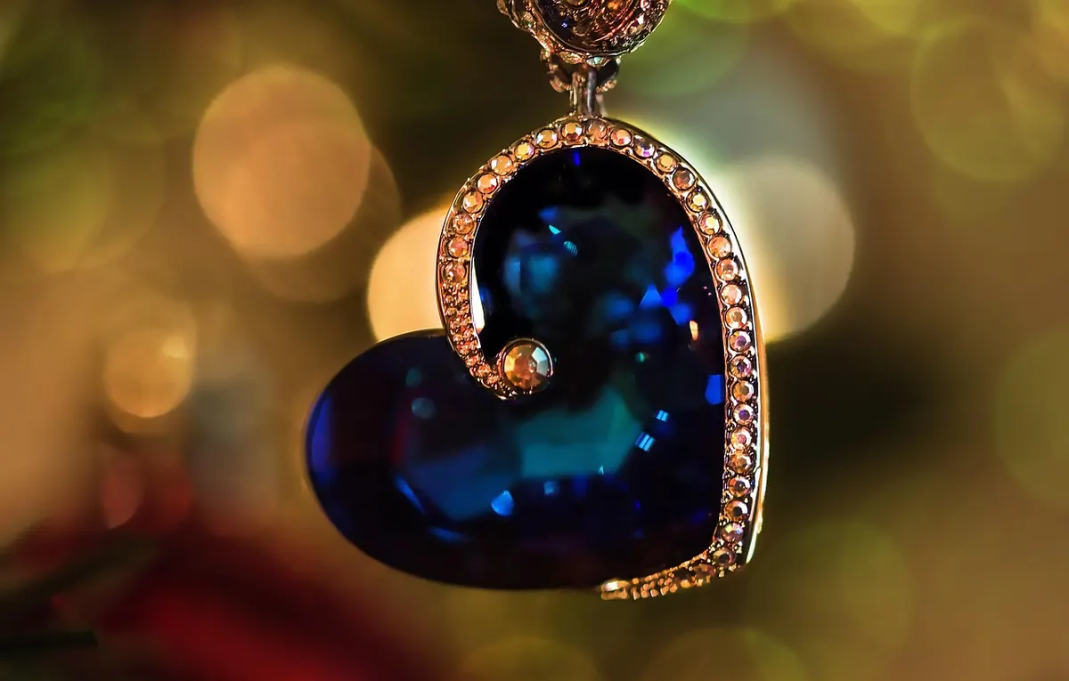
A stone can catch your eye in ten seconds and still be the wrong piece to live with. The gap between jewelry you reach for twice a week and jewelry that stays in the drawer usually comes down to three unglamorous details: the metal against your skin, the size of the stone, and the way it is set. Get those roughly right and the piece disappears into your routine, which is exactly what you want.
None of this needs a stylist or a lighting rig. It needs a window with decent daylight, a mirror, and an honest look at what you actually do between Monday and Friday.
Skin tone shifts with the season; undertone does not. That is why a gold ring that looked lovely in July can feel slightly off in February, while a silver one keeps working all year.
To find your undertone, stand near a window with a plain white sheet of paper next to your bare face. If your skin reads rosy or pinkish against the paper, you are probably cool. If it reads golden or peachy, you are likely warm. If it looks olive, greyish or simply hard to call, you are neutral, and you have the most freedom of anyone reading this.
A second check: look at the veins on the inside of your wrist in natural light. Greenish veins usually point warm, bluish veins point cool, and a mix of both suggests neutral. Neither test is exact, and plenty of people sit between categories. Treat the result as a starting point rather than a rule.
Warm undertones tend to sit comfortably with yellow gold, brass and bronze. Cool undertones usually look settled in silver, white gold and platinum. Neutral undertones can wear either, and often look best mixing both, provided one element repeats — the same stone, the same width, the same finish.
Your clothes matter as much as your skin. If your wardrobe leans cream, camel, rust and olive, gold will look native to it. If you live in black, charcoal, denim and cool white, silver is the easier companion. Oxidised silver reads darker and heavier, which suits people with strong contrast between hair and skin, and can look muddy on very fair, low-contrast colouring.
A dull or included stone often looks better in a warm metal, which flatters its earthiness. A very pale, clear stone can vanish against fair skin in silver unless the setting gives it some contrast.
Proportion does most of the work here. A 10mm stone reads as a statement on a small hand and as a quiet detail on a larger one. Neither is wrong, but the same piece will feel different on different people, so try before you commit.
For rings, something in the 6–8mm range suits most hands for daily wear; 4–5mm works well for stacking, and 10mm and up is a deliberate choice that will be noticed. For pendants, keep the stone roughly in proportion to the width of your collarbone area — a 15mm drop on a fine chain tends to read as a focal point, while 8mm reads as a subtle layer. On bracelets, measure your wrist with a strip of paper before you order, and size up slightly if you are between lengths so the beads drape rather than pinch.
Then ask the boring question: can you feel it? Heavy earrings get taken out by lunchtime. A tall ring gets removed before the gym. If a piece interferes with typing, seatbelts or sleep, it will not survive your week, however beautiful it is.
The setting decides how much of the stone you see, how protected it is, and whether it catches on your knitwear every time you pull on a sleeve.
Hardness deserves a mention too. Quartz, amethyst and citrine sit around 7 on the Mohs scale and handle daily wear well. Softer materials — fluorite, malachite, amber, opal, selenite — scratch, chip or cloud more easily, so they are better as pendants and earrings than as rings worn while gardening. Selenite and malachite also dislike water, perfume and household cleaners; put them on last and take them off first.
If your skin reacts to inexpensive base metals, stick to sterling silver, gold-filled or niobium. A persistent rash is worth showing to a doctor rather than guessing at.
Open your jewelry box and look at the three pieces you wear most. They are probably light, snag-free, and in a metal that matches most of your clothes. That is your blueprint.
When you are drawn to something bolder, ask how it fits beside those three. Layering works best with contrast in length rather than in style: a 40cm chain and a 50cm chain, or a slim band next to one substantial ring. Keep one element consistent — the same stone family, the same finish — and the combination looks intentional rather than accidental.
Photos help more than memory. Snap a picture of the piece next to your three most-worn tops, or hold it against your wrist in daylight rather than under shop lighting, which flatters almost everything.
A good crystal piece is not the one with the most dramatic inclusion or the largest stone. It is the one whose metal disappears against your skin, whose size sits right on your frame, and whose setting lets you forget you are wearing it. Buy for the person who gets dressed on a wet Tuesday morning, and the jewelry will still be on your wrist a year from now.
Photo: guvo59 / Pixabay
Learn to spot dye pooling, unnatural saturation, and coated surfaces with simple at-home checks, and read...
A practical guide to Italian mineral fairs: how the shows are organised, how pricing and etiquette work,...
A simple spring equinox routine for sorting, sunning, airing and recharging your crystal collection, with...